mozaic
design system

achieving consistency at scale across multi-service B2B2C platform

00

Client:

MediBuddy

My Role:

Associate Product Designer

Project Duration:

8 Months

Overview

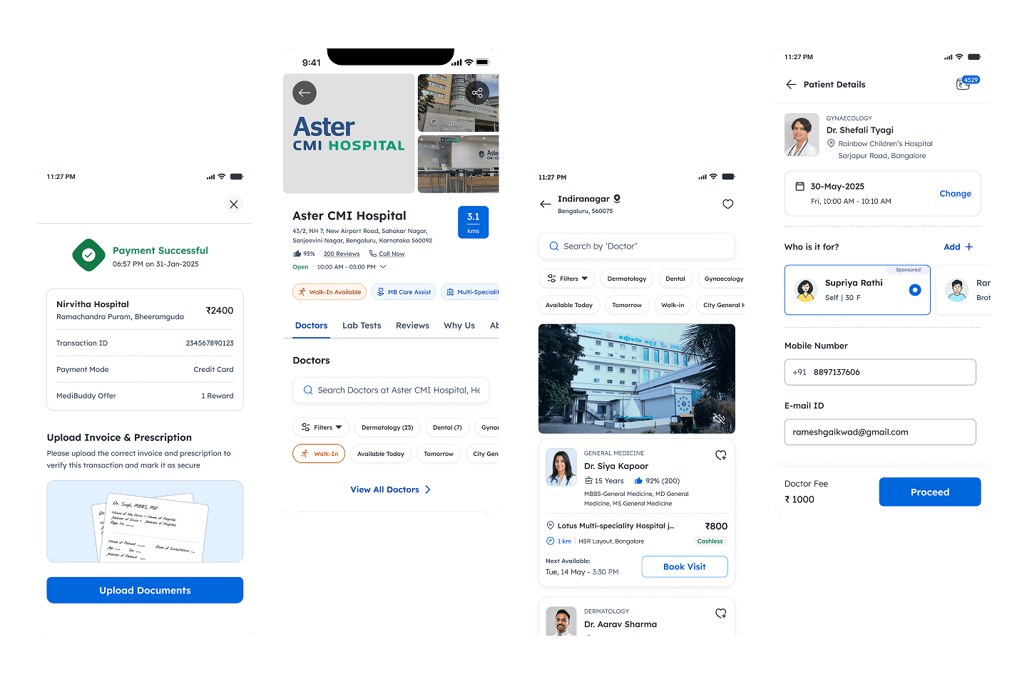
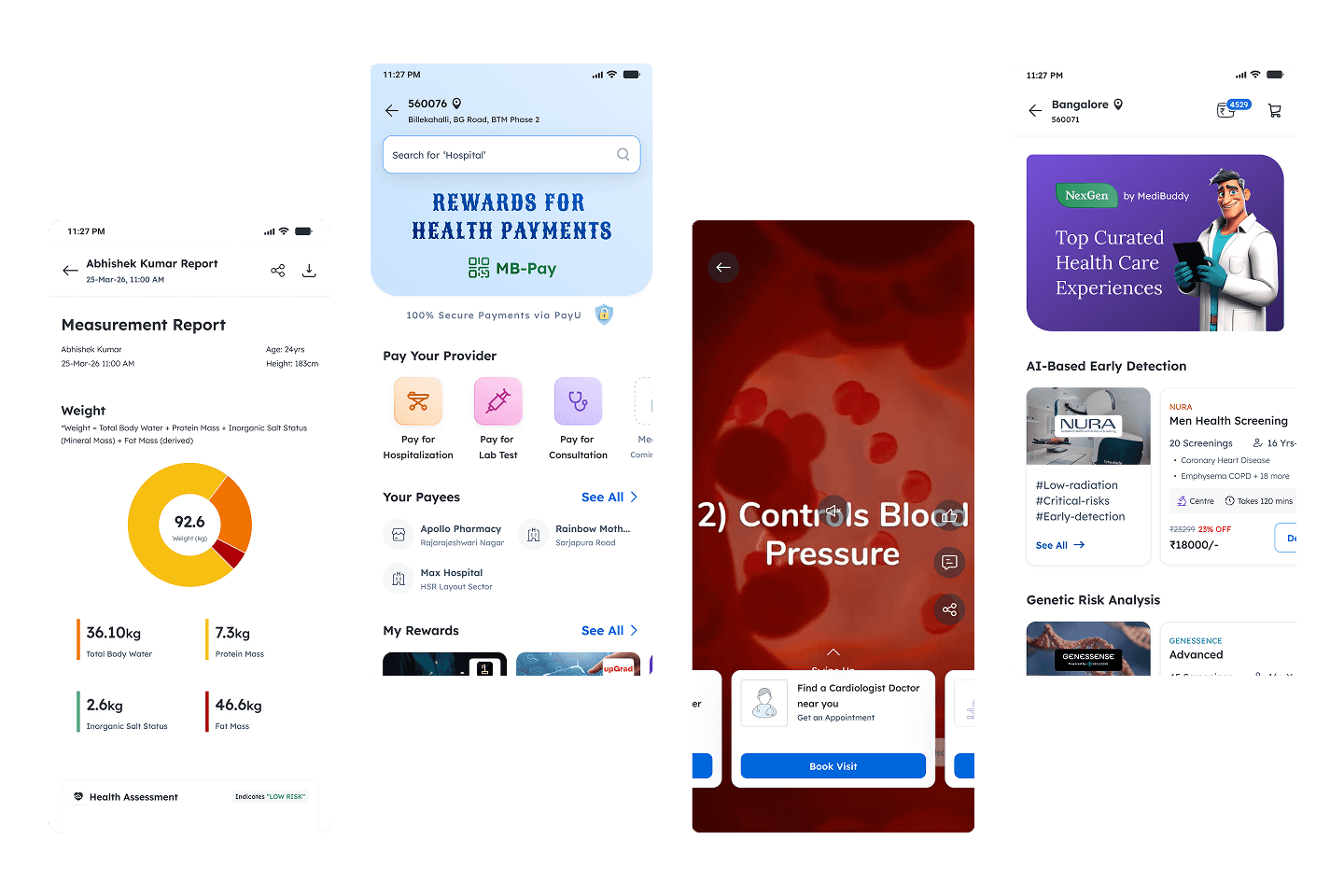
Mozaic is a design system built to support a rapidly growing B2B2C healthcare platform operating across multiple services — consultations, diagnostics, pharmacy, insurance, and wellness.

The goal was not just visual consistency, but a shared design language that could scale across teams, products, and levels of complexity — while remaining practical to adopt within real organizational constraints.

The Problem

“Each person is essentially building their own interpretation of the brand.”

- Head of Design during Problem Grooming

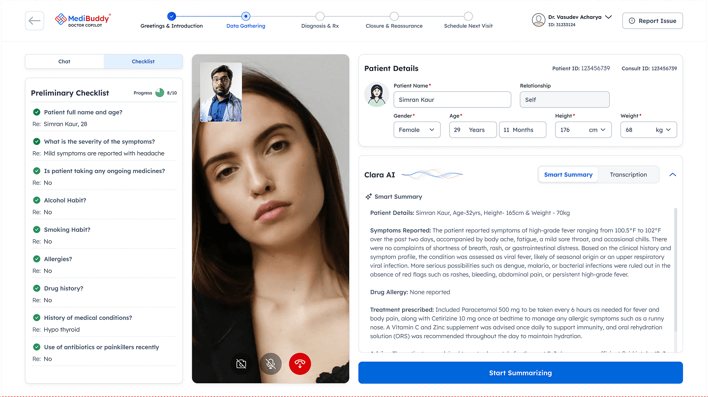
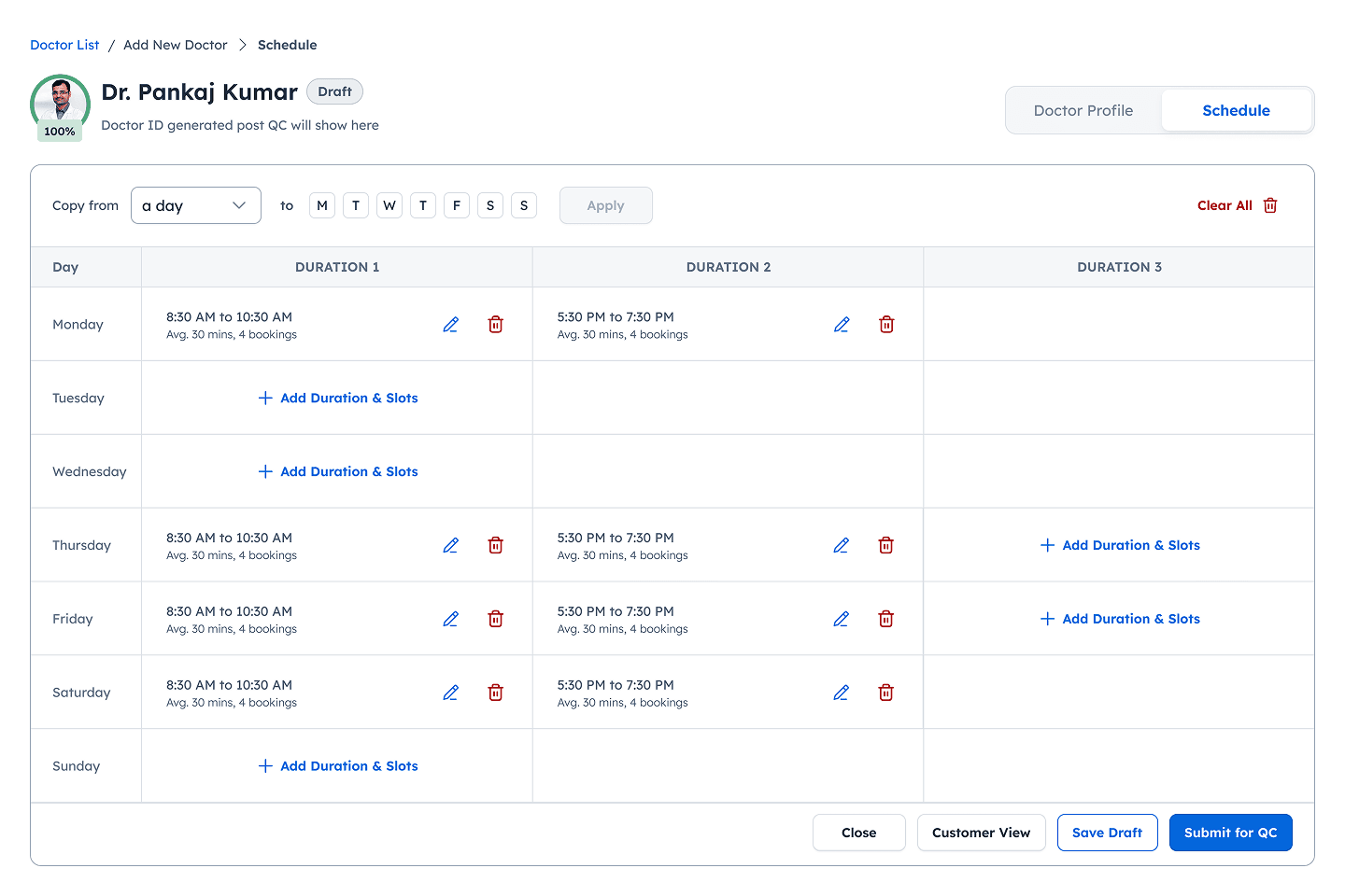
As MediBuddy expanded into multiple healthcare services, individuals began shipping independently, each evolving their own visual language, interaction patterns, and implementation approaches.

This led to:

01
01
Inconsistent visual & interaction patterns across domains

↪ Everyone started solving identical challenges in divergent ways causing fragmented UX and brand perception

02
02
Broken Design to Development Pipeline

↪ Lack of shared tokens, components, and behavior definitions caused ambiguous dev handoffs and reworks.

03
03
No adherence of WCAG guidelines

↪ Accessibility failures in core journeys

04
04
No governance model for components

↪ Components were frequently re-created or overridden

We needed a unified, flexible system that could work across diverse product contexts while staying stable, maintainable, and evolving with the brand.

Guiding Principles

These principles shaped every major design decision in Mozaic:

01

Build for practical workflows rather than ideal scenarios.

The system prioritized what designers could realistically use, allowing it to scale gradually without slowing teams down.

02

Encode system decisions once, reuse them everywhere.

Spacing, typography, states, and semantics were baked into the system so team could focus on UX problems, not repeated UI decisions.

03

Align behavior while allowing domain flexibility.

Shared interaction logic was prioritized over visual sameness, enabling different products to feel consistent. Visual consistency was a byproduct.

04

Promote reuse only after it proves value.

Patterns graduated into the core system only after demonstrating clear, repeated use across domains.

Building & Scaling Mozaic DS

Mozaic wasn't a static style guide. It evolved as a system in response to real product complexity, team behavior, and delivery constraints

Phase 1

Identifying Fragmentation

The priority was diagnosing where and why products were diverging.

  • Audited existing UI across consultations, diagnostics, pharmacy, insurance, and wellness

  • Identified repeated interaction patterns (beneficiary, upload module, navigation, badges)

  • Highlighted behavioral inconsistencies and design-to-dev bottlenecks

Phase 2

Establishing Shared Foundations

We replaced raw values with a system of logic to reduce unnecessary & repetative decision-making.

  • Implemented semantic tokens and a responsive typography hierarchy.

  • Standardized naming conventions between Figma and the codebase.

  • Kept foundations lean to prioritize immediate adoption over exhaustive completeness.

Deep dive into
Foundation & Token Architecture
Phase 3

Scaling Through Components and Patterns

With foundations in place, we targeted seamless feature handoffs to developers and supporting faster iterations as product complexity increased. To achieve this we:

  • Designed components as contracts with predictable APIs.

  • Defined elements by behavior and intent rather than just visual layout.

  • Mirrored component props between Figma and code.

  • New patterns were held in a reference library and only "promoted" to the core system once repeated reuse was proven.

Deep dive into
Components and Patterns
Phase 4

Adoption, Governance, and Iteration

As usage increased, the focus moved to sustainability.

  • Initial governance done through shared judgment over individual bias.

  • Followed regular release cycles with room for urgent fixes

  • Training, walkthroughs, and recorded handovers

  • Continuous refinement based on real usage and feedback

Governance was human-centered by choice, using documented decisions to eventually transition from manual oversight to scalable processes.

Impact

200+

200+

standardized reusable patterns & components

standardized reusable patterns & components

40%

40%

reduction in design-to-development TAT

reduction in design-to-development TAT

3x

3x

faster first-cuts using Mozaic + AI workflows

faster first-cuts using Mozaic + AI workflows

Application

Reflection

Building Mozaic improved my design and systems thinking skills through rigorous trade-off analysis and evidence-based decision-making in a complex product environment.

  1. Practical constraints like team maturity and delivery deadlines are inevitable and require a focus on accurate tradeoffs and restraint rather than theoretical perfection.

  2. Components & Patterns should earn their place in the system by resolving observed friction or repeated inconsistencies in active workflows.

  3. Adoption is the true north star. Systems only remain relevant by evolving alongside product needs rather than adhering to rigid, upfront definitions.

Topic Deep Dives

Foundation & Token Architecture

Components & Patterns

AI-Assisted Workflows

How Mozaic enabled consistent, system-aligned UI generation using AI tools.

AI-Assisted Workflows

How Mozaic enabled consistent, system-aligned UI generation using AI tools.